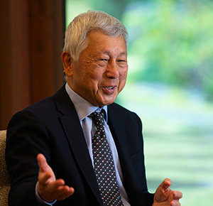
It all started with a simple question: Was there any way to make letters—the alphabet of the West and the kana and kanji of Japan—look better together? The search for the answer prompted a one-time Japanese “salaryman” to leave his job, head to London, and become a full-fledged typographer. Meet Kono Eiichi, the world-famous designer behind the London Underground’s trademark New Johnston font and the popular, Windows-installed Meiryo font. In this article, Kono takes us into his craft for an enlightening look at the interplay between typeface and international communication.
[November 2018]
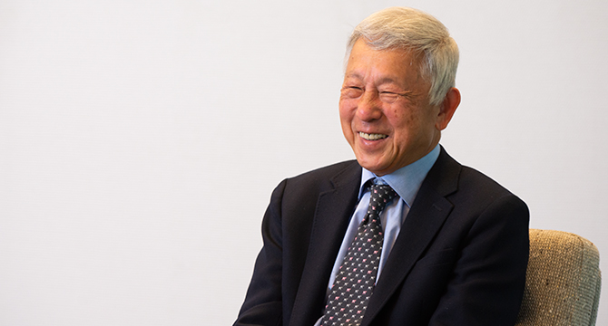
Kono Eiichi, born in Tokyo in 1941, is a UK-based typographer. After moving to the UK in 1974, he studied typography and information graphics at the London College of Printing and the Royal College of Art. Upon graduating, Kono embarked on an illustrious career that has seen him redesign London Underground’s official typeface, optimize the page spacing and readability of the British Telecom phone book, design Meiryo (a standard font for Microsoft Windows OS), standardize information design for The Economist, and help create a variety of logos. His latest projects include the development of a new font, “CCArtSansZenBK” (tentative), which continues Kono’s pursuit of communication across language in the digital realm.
A red and blue roundel: people around the world instantly recognize that distinctive motif of the London Underground logo. At the heart of the design is the New Johnston font, which has shaped the look of virtually every Underground station sign and publication since the 1980s. In the spirit of the original Johnston font, New Johnston balances simplicity, humanity, and perceptibility to cut through the glut of textual information filling urban landscapes.
We never knew that a Japanese person helped create one of the most iconic symbols of London. How did that come about?
I quit my company job in 1974, when I was 33, and went to the UK to learn typography. I spent five years studying before I got an offer from a design firm in 1979, as I was about to graduate. They were revamping the classic Johnston font— and that was my first real job in the field. Johnston gets its name from calligrapher Edward Johnston, the “god” of twentieth-century Western typography who created the type for the London Underground’s station signs and posters in 1916. The typeface was a hit worldwide; it distilled the classic proportions of Roman-era stone carving and the humanistic elegance of Renaissance-era technical refinements into a modern, sans-serif typeface [a style without any extending features at the end of letter strokes]. Look at fonts like Gill Sans, Helvetica, and Univers, which are still popular, and you’ll see Johnston’s influence. The font only had two weights [thicknesses], though, and it was hard to size. Recognizing the limitations of the original Johnston, Transport for London finally decided to give the font a makeover after 60 years of use. The job just fell into my lap.
When printing evolves from letterpress to phototypesetting, fonts have to follow suit.
Exactly. Gutenberg’s invention of the printing press in the fifteenth century was a huge turning point in cultural history—it enabled people to communicate ideas across space and time. For about five centuries after that, the standard approach was to carve letters into metal or wood. Phototypesetting came along in the latter half of the twentieth century, and the mainstream format these days is digital typesetting. Johnston, however, didn’t fit well with phototypesetting and to make sure people could read it across a broad range of sizes, from big station signage to the fine print on route maps, it needed to be modernized.
We had a month to get our presentation ready. But at the office, I found only a smattering of supplies: an outdated diazo copier, a few drawing pens, and a handful of brushes. It wasn’t just my first time designing a font as a professional—it was my firm’s first font project, too [laughs]. Before the digital revolution, font design was the domain of big font firms. I didn’t have any original patterns to work from; the only clues I had were some old Transport for London posters and proportion numbers for other fonts. All I could do was sit down and draw everything out, letter by letter, all by hand. I had one of my old colleagues in Japan send me a microscope and some lenses, which gave me a much closer look at the letter proportion in different sizes. Eventually, I came up with a finished set: a medium-weight [between bold and regular] prototype. Luckily Transport for London recognized that it had the right kind of versatility. They approved the design, and I spent the next 18 months working up a family of eight styles [bold, italic, light, condensed, etc.]—the complete New Johnston.
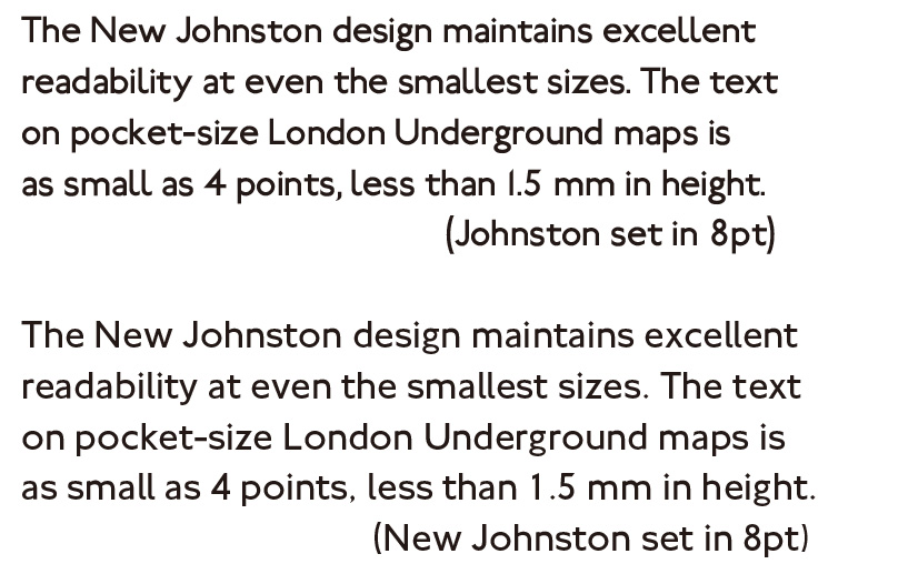
Original vs. New (digital simulation)
*Railway font by Justin Howes & Greg Fleming, 2012
What led you to study typography in the UK?
In Tokyo, I worked in public relations for Carl Zeiss, a global optical-lens manufacturer. One of my jobs was to localize catalogs from the head office in Germany for the Japanese market. To preserve the look of the German text, I tried to use a good mixed-language [Japanese-Western] typeface, but nothing seemed to come out right. Back then, there weren’t many Western fonts or even people who knew much about Western typesetting in Japan. I was almost at the end of my tether when someone introduced me to Takaoka Juzo, the proprietor of a small letterpress workshop in Tokyo called the Kazui Press. Not only did organizers of the 1964 Tokyo Olympics choose him to print the certificates for top finishers, but he was also the only Japanese person to hold both a membership in the British Printing Society and the title of “master printer.” He obviously knew Western typefaces and page design inside and out. When I asked him for letterhead and leaflet ideas, he came up with exquisite designs that the company president in Germany absolutely loved. I started going to weekly sessions where he’d teach young designers and artists in a corner of his workshop. Meeting Takaoka-san changed my life.
What inspired you to get into Western typefaces?
A big inspiration was Stanley Kubrick’s 2001: A Space Odyssey, which came out 50 years ago. After the movie, Takaoka-san asked me if I’d recognized the font Kubrick used for the opening title. “Futura?” I guessed. “Nope,” he said, “Gill Sans. And remember when the apes figured out how to use bones as tools? He used Albertus for that scene,” Takaoka-san explained. “The end credits are in Futura.” Gill Sans was the work of Johnston student Eric Gill, who used Johnston Sans as a touchpoint and ancient Roman inscriptions as a model to create Gill Sans in 1928. Albertus was by a German calligrapher named Berthold Wolpe, who in 1932 modeled the type to look like letters chiseled and carved into rock or metal. Futura, “future” in Latin, is Bauhaus designer Paul Renner’s rendering of the mechanistic look of future civilizations. Kubrick’s film used the historical contexts behind the fonts to turn typeface into a storytelling device. For me, 2001 was a revelation. I started to see why Takaoka-san and those young designers were so keen on typography.
Kono does more than just design looks. In the 1980s, for example, British Telecom asked him to help restyle the phone book. The new space-saving design enabled the company to reduce its paper consumption by about 2,700 tons—roughly 10% of the total print volume—and cut yearly costs by around 1 million pounds. In the twenty-first century, meanwhile, the seismic shift from paper to electronic display is redefining Kono’s work.
The Japanese font Meiryo has won acclaim from web designers and font aficionados for its on-screen readability. How did the project get started?
 It started with a call from a colleague at Oxford, someone who’d helped me with the New Johnston project. “Do you think we could sit down for a chat?” he asked, and I was happy to oblige. Then he told me where he wanted to meet: Seattle, Washington [laughs]! He’d taken a job as a typography advisor for Microsoft. Since the mid-1990s, Microsoft had been making big strides in having letters look clearer and smoother on LCD screens. One issue, though, was how to deal with Japanese text—a language where the sheer number of characters is daunting, not to mention their complexity. The company had organized a feasibility team, and they brought me on board to help find a font design that’d be easy to read on any medium— screens or paper—and deliver optimal harmony between Japanese text and Western text. After four months of research, though, we still hadn’t located a typeface that fit the bill. We decided to come up with a solution from scratch.
And that’s how you started developing your own mixed-language font.
Right. Western text and Japanese text are completely different. Western text runs horizontally with distinct inter-word spaces, which means that the inter-letter spacing has to be tight enough to form words. In written Japanese, which originally ran vertically, each character sits at the center of a uniform square; every space has identical dimensions, so there’s no such thing as bunching individual characters together into units (Fig. 1). For a long time, there’d been a real struggle to make Japanese and the alphabet look presentable together in the horizontal orientation common abroad. It was a lot of trial and error—and we had to clear those hurdles (Fig. 2).
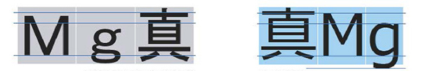
Fig. 1 Conventional approach (left) Fig. 2 Meiryo approach (right)
Did moving from print media to the screen-display format pose any new challenges?
In the early 2000s, Microsoft was busy developing a revolutionary technology to take advantage of the “subpixels” on color LCDs—the individual red, green, and blue [RGB] components of a single pixel. By using RGB components separately instead of the entire pixel, one could create a more intricate gradient to smooth the curves of on-screen characters (Fig. 3). Microsoft floated the idea of using subpixel rendering to make kanji easier to read. Taking on that suggestion, I drew up a prototype with the help of C&G, a Japanese firm with an impressive track record in fonts for word processing. I presented the results to Microsoft, and in a stroke of pure luck, Furukawa Susumu—then the president of Microsoft Japan—happened to be in Seattle at the time, saw my presentation, and urged Bill Gates to use my idea.
Although Microsoft gave me the official green light in 2002, they requested development within two years. The English alphabet only has 26 letters, so anyone might think it wouldn’t take that long to design a font. Japanese, however, has more than 23,000 characters—and that’s just under the JIS [Japanese Industrial Standards] code. Factor in things like special characters, symbols, and bold renderings, and you’re dealing with around 50,000 characters in total. The prospects were a bit worrying, but C&G told me that one of their partners— Arphic, a Taiwanese font firm—had high-speed font-creating technology I could use. What they’d developed was a system for analyzing the synthesis patterns of kanji radicals and automatically generating the corresponding characters via special software. Take the kanji for “tree” [木], for example. Arphic’s software made it possible to transform that into so many variations: slimming and doubling to create the character for “grove” [林], or flattening three “tree” characters into “forest” [森]. I probably wouldn’t have been able to find that technology outside the Sinosphere. For the alphanumerical side of the font, I enlisted Matthew Carter—the designer behind the world-famous Verdana typeface, which came out in 1996 and garnered a sterling reputation for readability. He optimized Verdana for maximum affinity with Japanese text. It was quite a team, and we managed to finish the basic set in two years. After two more years of hinting [the process of optimizing complex kanji for on-screen display at small sizes, such as safeguarding against broken lines and blurring] and stroke reduction [adding data on predetermined variations with reduced stroke counts], Microsoft started bundling the Meiryo font family into Windows OS packages in 2007. We were lucky enough to win a 2007 Good Design Award and Tokyo TDC Annual Award.
![]()
Fig. 3 Subpixel rendering turns RGB components into a finer-tuned gradient, creating delicate shading that smooths character contours.
The project was a truly international effort, then. How do you see typography evolving into the future?
These days, you can see Japanese text and Western text side by side virtually everywhere you look: from books to business documents. As long as cultures and academic discourse keep reaching across borders, the demand for mixed-language resources will keep on growing. I’m looking forward to designing more fonts that meet those social needs and help the world better understand the ever-diversifying mix of languages and cultures around us.
This interview was conducted in Japanese on November 6, 2018.
Interviewers: Sasayama Yuko, Maeda Manami (Program Department, International House of Japan)
Photographer (interview): Kodera Kei
©2019 International House of Japan
To view other articles, click here.